Message
Messages communicate information and alerts to users.
No guidance is written for this component. Write it in content/components/message.md — the build reads that path from this page's route and merges the file in here.
Where it exists
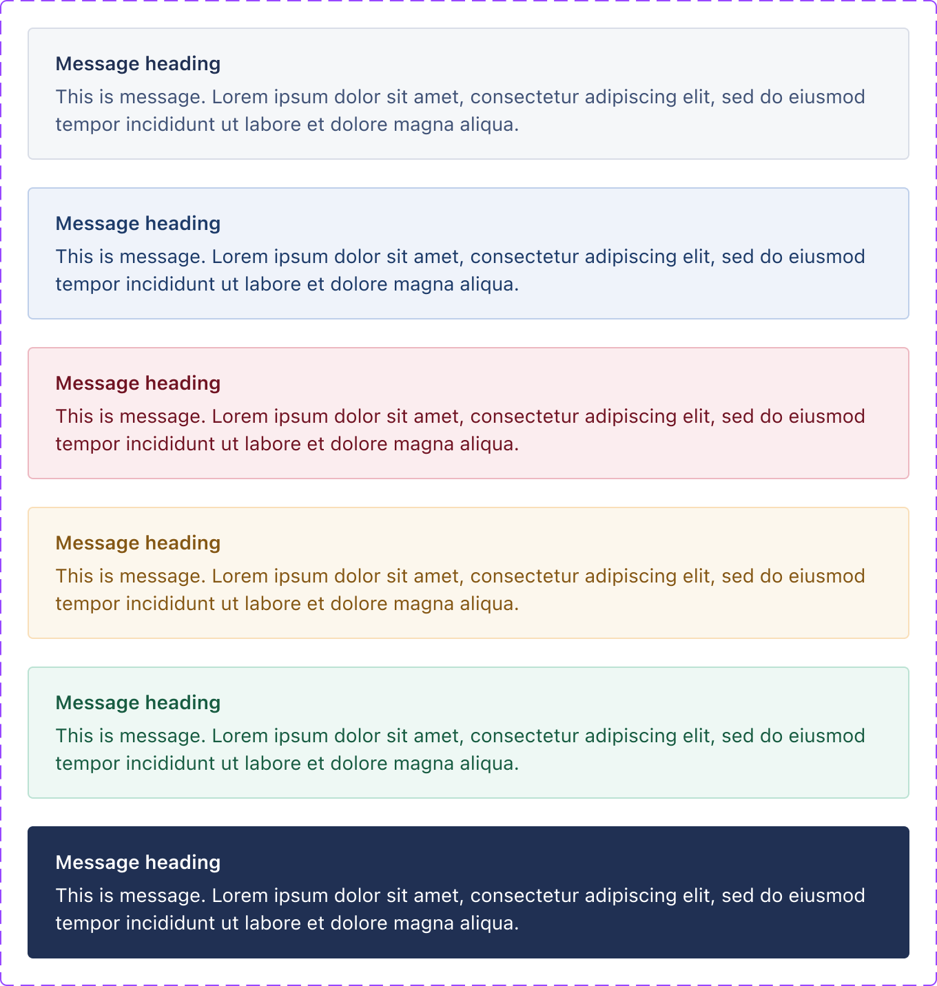
Message set, 6 variants. Downloaded and served from this site, so it cannot expire; it is a picture of the library as it stood when the sheet was captured, not a live view. Values are never readable from it — the token pages carry those.ui-message--default (open it in Storybook). One of 5 stories. Drag the bottom edge to resize. ⚠️ The frame renders the component at the frame's own width, so in a narrow pane you are seeing a narrow rendering rather than the canonical one.| axis | value |
|---|---|
| React module | yes — shared UI library |
| React tier | library |
| CSS class | .c-message |
| CSS files | markdown.css, message.css |
| Storybook | yes |
| Figma | Message, Message |
| Uses in product | 84 |
| Uses in admin | 50 |
| Seen as | css-class-attribute, jsx-tag |
| Join provenance | inferred:kebab |
An empty cell above is a measurement, not an omission: every axis is printed whether or not it is populated. What each one costs is on /gaps.md, linked from the axis name wherever this page has a gap.
Members
A member is attached to its parent at module scope, so it is imported through the parent and versioned with it. Members have no page of their own: they declare no CSS class, carry no story and join no Figma set, and their uses are counted against the parent rather than separately.
Message.Title— 5 uses in the product