Map
A graph map shows how things are connected. Use one when understanding relationships, direction or impact matters more than comparing individual values.
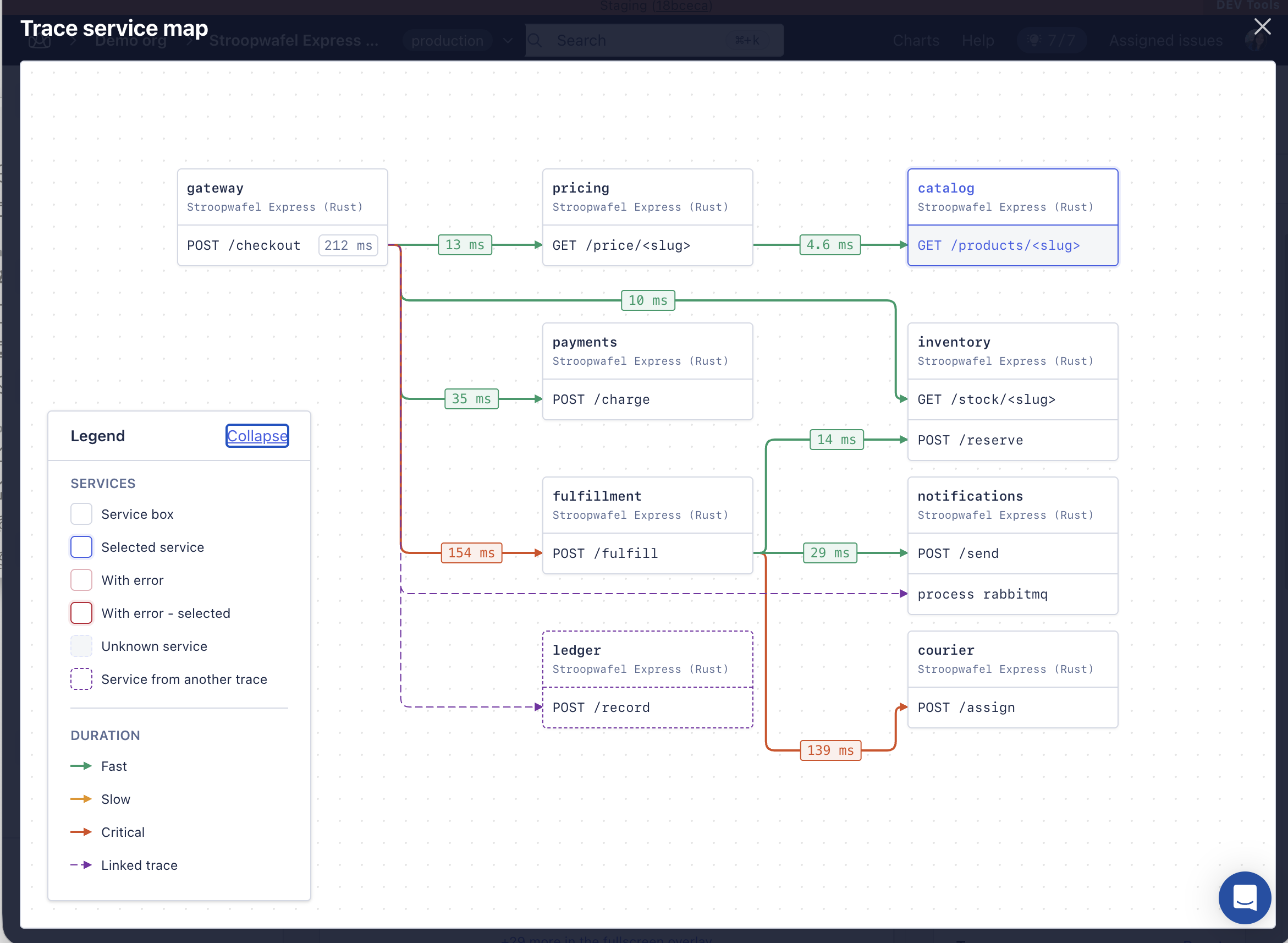
It began as the trace service map and is now a shared pattern any page can render with its own data. The trace service map visualises how a distributed trace moves across services and spans: each service card groups the spans reported by that service and identifies the application they belong to, and connections attach to individual spans, so the map keeps the span-level execution flow while grouping related activity by service.
Group by service, connect by span. Service cards give the trace its higher-level structure; span-level connection points show the actual execution path through and between those services.
When to use one
Use a graph map when the question is about connection, direction or impact. The map has to make a path easier to understand than a list or a table would.
| Question | Pattern |
|---|---|
| Which services and spans are in this trace, and how does execution move between them? | Graph map |
| Which service or endpoint has the highest duration? | Table or chart |
| What belongs under this parent? | Waterfall |
| What happened first, and what happened next? | Timeline |
Anatomy
| Part | Purpose |
|---|---|
| Canvas | The pannable surface that contains and positions the graph. |
| Service card | Groups trace activity by service. It names the service and the application, then lists the spans that took part in the trace. Connections can enter or leave an individual span, so the map shows span-level execution without losing the service grouping. |
| Edge | The direction the distributed request continued in, from one service to the next. |
| Edge label | A value describing the handoff — a duration, typically. This is what reveals where time is spent along the trace. |
| Legend | Explains the service states, linked traces and duration tiers that cannot be inferred from the graph. It can collapse when space is short. |
A service card carries three things, in this order of prominence: the service name, which is the entity a reader follows through the request path; the app name, as secondary context, naming the AppSignal application that reported this service's data; and one row per span — the operation from the current trace that ran in that service, which is what connects the map back to the underlying trace.
Layout follows the relationship
A graph map does not require a fixed reading direction. Choose the layout that makes the underlying relationship easiest to follow.
| Relationship | Layout |
|---|---|
| Trace, request flow, dependency chain | A consistent directional layout — left to right, say — so the path is easy to scan. |
| Hierarchy or ownership | A layered layout that reinforces parent and child. |
| Topology, many-to-many, complex network | A network-like arrangement. Position nodes to reduce overlap and crossings rather than forcing a reading direction. |
Let the shared graph layout position the map. Don't hand-place nodes per page. Routing, spacing and label placement come from the graph implementation, so that similar maps behave the same way.
- Use a clear primary direction when the data has an inherent sequence or hierarchy. Don't impose one when position is only being used to separate and clarify complex relationships.
- Route edges around nodes, and keep labels off card boundaries and arrowheads.
- Preserve enough spacing to tell parallel branches and linked traces apart.
- When the map gets too dense, filter, group or progressively reveal detail rather than shrinking everything.
Nodes and connections
A node answers two questions at a glance: what is this? and does it need attention? Keep metrics that describe a relationship on the edge, rather than duplicating them inside the spans or cards at either end.
Nodes
- Lead with the service name and keep the app name secondary, so the service stays the clearest grouping cue.
- Show each relevant span or operation as its own row — a distinct connection target inside the service card.
- Keep span ordering and labels stable enough that a reader can follow several incoming and outgoing requests without losing context.
- Selection is a persistent state, and must stay visually distinct from hover and from error.
- Error, unknown and cross-trace states need a non-colour cue as well: border style, label, icon or line pattern.
Connections
- Connect the specific source and target spans whenever the trace data supports it. Don't collapse that into a generic card-to-card edge.
- Use an arrow to show direction.
- Show a duration label where it helps locate where the trace spends its time.
- Use duration tiers consistently — fast, slow and critical have stable tokens and thresholds, supplied by the product logic.
- Use a distinct dashed style for linked traces, and for any relationship that comes from outside the current trace.
Exploring the map
A reader should be able to scan a path quickly without losing their place. Hover is temporary; selection is persistent.
| Interaction | Behaviour |
|---|---|
| Hover a service card | Highlight the complete connected flow into and out of that service, and mute unrelated nodes and edges. |
| Hover a span or duration label | Reveal the same full upstream and downstream flow as card hover, entered from the hovered span-level connection. |
| Click a service or span | Close the graph overlay, return to the trace page, and update the timeline to that service's context. |
Legend and states
The legend explains the visual language a reader cannot reliably infer from the graph itself: service state, linked-trace relationships, and what a duration means on a span-level connection.
| Treatment | State | What it means |
|---|---|---|
 | Service box | A service in the current trace, with no state emphasised. |
 | Selected service | The service matching the trace page's current timeline context. It tells the reader where they entered the map from. |
 | With error | A service associated with an error. If it is also the current timeline context, both states have to stay visible. |
 | With error, selected | The service with an error that also matches the current timeline context. |
 | Unknown service | The relationship is known, but AppSignal cannot resolve the service's details. |
 | From another trace | A service reached through a linked trace rather than the current one. |
 | Fast | A duration tier on a span-level connection. Pair the colour with the numeric label. |
 | Slow | A duration tier on a span-level connection. Pair the colour with the numeric label. |
 | Critical | A duration tier on a span-level connection. Pair the colour with the numeric label. |
 | Linked trace | A connection crossing into another trace. Distinguish it by line style, not colour alone. |
Preview and fullscreen
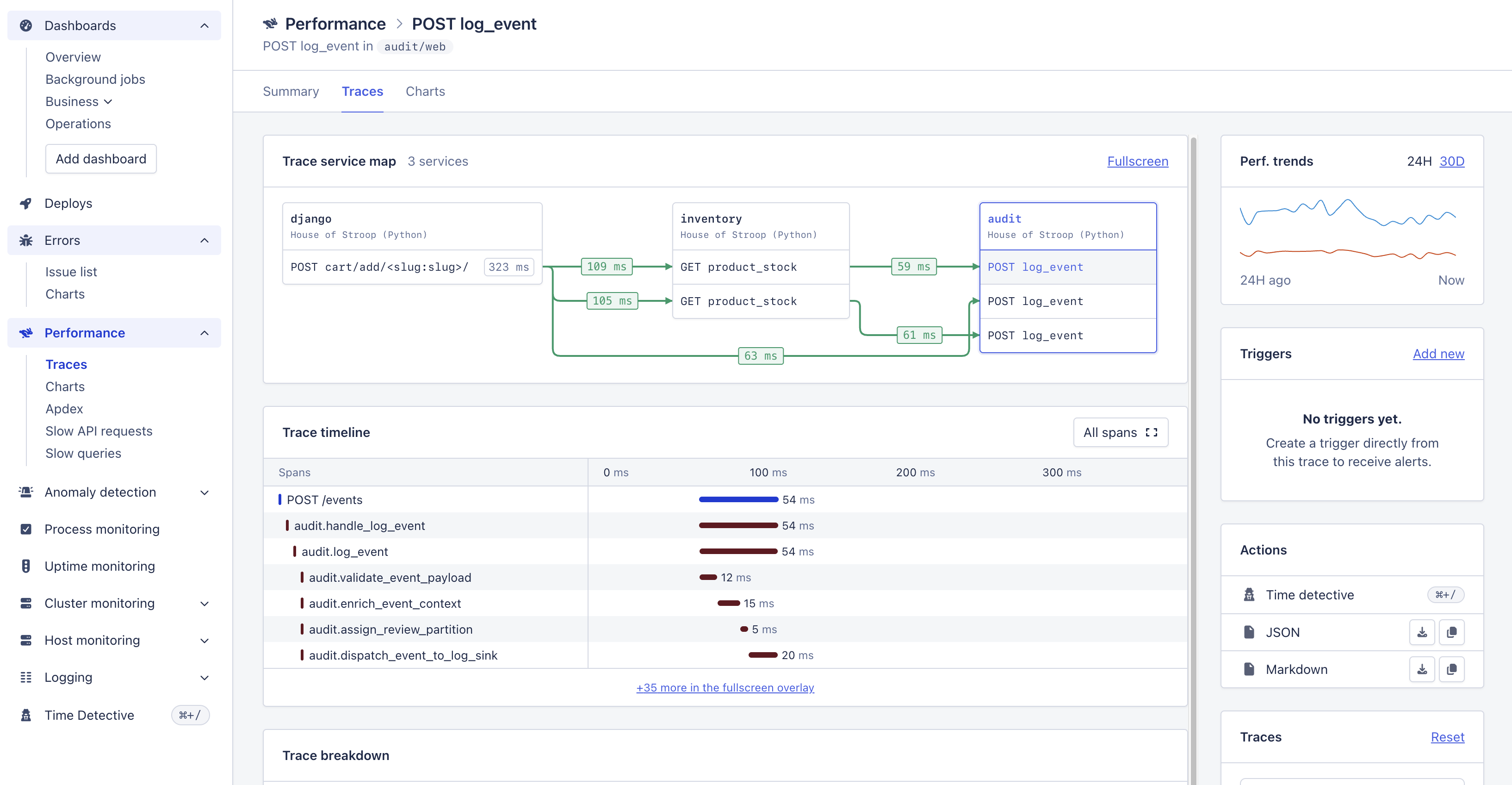
The trace service map first appears as an embedded preview on the trace page, beside the timeline and the rest of the trace information. Its job there is orientation: show where the current service or span sits in the distributed flow, without taking over the page.
The preview has limited space, so a larger trace will extend past the visible area. Don't compress cards or labels until the whole graph fits. Keep the graph readable, show the most useful surrounding context, and give a clear Fullscreen action for complete exploration.
| Surface | Purpose and behaviour |
|---|---|
| Embedded preview | Supports a quick context check while the timeline stays visible. Keep service and span content readable, even when that means not every node or branch is visible at once. |
| Fullscreen | Opens the same graph in an overlay with substantially more room for the full topology, branches, legend and path exploration. Re-frame the graph for the larger viewport rather than scaling the preview up. |
Preview for context; fullscreen for exploration. The preview does not have to prove that the entire graph fits in its container. Where space limits comprehension, keep the graph content readable and let fullscreen carry the complete view.