Toggle
Toggles switch between enabled and disabled states.
A toggle switches between two mutually exclusive states, and the change takes effect immediately — no submit. That is the whole distinction from a checkbox; see forms for the full control-selection table.
Rules
- Use clear binary states. Avoid ambiguous or multi-step outcomes.
- Make the current state visually obvious without relying on the label alone.
- Settings only — never for one-time or destructive actions.
- Never for navigation or form submission.
- Inside a form saved on submit, use a checkbox instead.
Where it exists
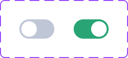
Toggle set, 2 variants. Downloaded and served from this site, so it cannot expire; it is a picture of the library as it stood when the sheet was captured, not a live view. Values are never readable from it — the token pages carry those.ui-toggle--default (open it in Storybook). One of 2 stories. Drag the bottom edge to resize. ⚠️ The frame renders the component at the frame's own width, so in a narrow pane you are seeing a narrow rendering rather than the canonical one.| axis | value |
|---|---|
| React module | yes — shared UI library |
| React tier | library |
| CSS class | .c-toggle |
| CSS files | toggle.css |
| Storybook | yes |
| Figma | Toggle, Toggle |
| Uses in product | 5 |
| Uses in admin | 0 |
| Seen as | css-class-attribute, jsx-tag |
| Join provenance | inferred:kebab |
An empty cell above is a measurement, not an omission: every axis is printed whether or not it is populated. What each one costs is on /gaps.md, linked from the axis name wherever this page has a gap.
Members
A member is attached to its parent at module scope, so it is imported through the parent and versioned with it. Members have no page of their own: they declare no CSS class, carry no story and join no Figma set, and their uses are counted against the parent rather than separately.
None. Nothing is attached to this component as a member.