Select
Use a select when the reader picks one or more values from a predefined list to store as form data. Always paired with a select box as its trigger.
Reach for it over a radio group when the list is long, or when the choice controls other content on the page:
- filtering a table
- switching a dashboard view
- updating a dependent field's options
It opens in a dropdown, the panel shared with combobox and menu. This page covers what goes inside it.
Single and multiple
Single and multiple are one component. ui/Select ships a Multiple story rather than a second module, so what changes is the row.
| The row | Example | |
|---|---|---|
| Single | An optional leading icon, the label, and a trailing checkmark on the chosen row, which is also highlighted | Severity, status, category |
| Multiple | A checkbox on the left, then an optional icon, then the label | Environments, namespaces, tags |
- Close a single select once a value is chosen. Keep a multiple select open, because the reader is not finished after one choice.
- Support
Alt-click in a multiple select to reduce the selection to one option. It is the fast path out of a fully checked list, and it needs to be stated in the panel, because nobody guesses a modifier key. - Use multiple only for values that belong to one field. Options that are independent of each other are checkboxes in the form instead. See forms.
Group headers
A select may group its options under headers. A header labels a run of options and is not selectable.
Keep header capitalisation consistent across every select in the product. The design library currently mixes PINNED and APPS with Member and Assigned in the same family of menus, which is drift rather than two kinds of header.
Select and menu
A select stores a value. A menu runs a command and stores nothing. If choosing an item takes effect immediately and writes nothing to a form, it is a menu.
Both open in the same dropdown, so the trigger carries the distinction: a select box for a value, an avatar or icon button for a command.
Select and combobox
A combobox is this component with a search field in the panel, and that field is the only thing separating them. Use one when the list is long, or when its contents come from data.
Grouping, single and multiple, and leading icons are options on both. They are not reasons to choose between them.
What this page cannot tell you
What the trigger shows once a value is chosen. The guidance adopted from the live docs site says the selected value stays in the trigger, so the trigger also reports the current state. The design library draws it differently: in both the single and multiple menus, the trigger keeps the field name — Severity, Namespace — while options are visibly chosen behind it.
⚠️ Only one of these can be the rule. A multiple select sharpens the question, because five namespaces do not fit in a select box. Settle it against the shipped component before this page states either.
Where it exists
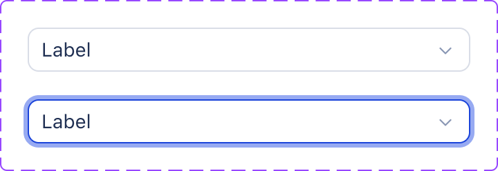
Select set, 2 variants. Downloaded and served from this site, so it cannot expire; it is a picture of the library as it stood when the sheet was captured, not a live view. Values are never readable from it — the token pages carry those.ui-select--default (open it in Storybook). One of 8 stories. Drag the bottom edge to resize. ⚠️ The frame renders the component at the frame's own width, so in a narrow pane you are seeing a narrow rendering rather than the canonical one.| axis | value |
|---|---|
| React module | yes — shared UI library |
| React tier | library |
| CSS class | .c-select |
| CSS files | select.css |
| Storybook | yes |
| Figma | Select, Select |
| Uses in product | 24 |
| Uses in admin | 8 |
| Seen as | css-class-attribute, jsx-tag |
| Join provenance | inferred:kebab |
An empty cell above is a measurement, not an omission: every axis is printed whether or not it is populated. What each one costs is on /gaps.md, linked from the axis name wherever this page has a gap.
Members
A member is attached to its parent at module scope, so it is imported through the parent and versioned with it. Members have no page of their own: they declare no CSS class, carry no story and join no Figma set, and their uses are counted against the parent rather than separately.
None. Nothing is attached to this component as a member.